Chart Types & Styles
Chart Types & Styles
What is your process when you set out to make a data vizualization? Do you sketch what you are trying to show or discover? If using Tableau do you just start throwing variables into frame? Below is a useful though starter as you plan your data viz.
Chart suggestions a thought starter
Visualization of most common business data only requires 2 dimensional representation. Adding a third variable can be confusing for people who don't work with data everyday. So lets keep it simple and go through some of the decision making steps when deciding which visualization to use.
Three important things to consider are:
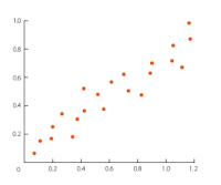
Relationship
A scatter plot is good for visualizing when you have two variables and you would like to see how a change in one affects the other.
Scatter
When you have 3 or 4 variables you can make a bubble chart where the size or color of the dots convey more information.

Comparison
Bar Charts are a simple way to compare two sets of data. This could be location one vs location two or with test condition A verse with test condition B.

When working with time series data a line chart provides an indication of a continuous variable, time or date. It's important to not use too many lines. More than three can be hard to digest.

Distribution
Histograms let you see the distribution of your data points.

Composition
Stacked area chart allows you to see what parts make up the whole. Have all sectors been growing at the same rate?

Now there are many, many more types of charts (Box-plot, heat-map, etc) but these are the basics and I find it useful to start with one of these and move on from there.
What is your process when you set out to make a data vizualization? Do you sketch what you are trying to show or discover? If using Tableau do you just start throwing variables into frame? Below is a useful though starter as you plan your data viz.
Chart suggestions a thought starter
Visualization of most common business data only requires 2 dimensional representation. Adding a third variable can be confusing for people who don't work with data everyday. So lets keep it simple and go through some of the decision making steps when deciding which visualization to use.
Three important things to consider are:
- Number of variables
- If you have more than four you may be in for a cluttered, unclear chart.
- Type of variables
- Numeric- Discrete or continuous
- Categorial - related or unrelated categories
- Association you are trying to show
- Relationship
- Multiple variables. Dependent or Independent.
- Comparison
- Difference or Similarity. Trends over time.
- Distribution
- What does the distribution of data points look like
- Composition
- Categorical data. What percent of the total is each category? How do the categories change over time
Relationship
A scatter plot is good for visualizing when you have two variables and you would like to see how a change in one affects the other.
Scatter

When you have 3 or 4 variables you can make a bubble chart where the size or color of the dots convey more information.
Bubble

Comparison
Bar Charts are a simple way to compare two sets of data. This could be location one vs location two or with test condition A verse with test condition B.
Bar

When working with time series data a line chart provides an indication of a continuous variable, time or date. It's important to not use too many lines. More than three can be hard to digest.
Line

Distribution
Histograms let you see the distribution of your data points.
Histogram

Composition
Stacked area chart allows you to see what parts make up the whole. Have all sectors been growing at the same rate?
Stacked Area

Now there are many, many more types of charts (Box-plot, heat-map, etc) but these are the basics and I find it useful to start with one of these and move on from there.
Excellent post. I learned a lot from this blog and I suggest my friends to visit your blog to learn new concept about technology.
ReplyDeleteccna course in Chennai
Python Training in Chennai
R Programming Training in Chennai
AWS Training in Chennai
DevOps Training in Chennai
Angularjs Training in Chennai
RPA Training in Chennai
Data Science Course in Chennai